
Creative Bloq
An End-to-end Website for Creatives
Project Overview
Creative Bloq is one of the world's biggest design and art platforms where people can find a daily mix of advice and inspiration for designers, artists, illustrators, and more. As part of their vision states:' We bring the very best creative work to our audience and offer the insight that enables them to keep up to date with the latest trends and developments in global design and to create their best work.' However, aiming to be a platform that inspires designers, artists, illustrators, their website design lacks freshness and is far away from new trends.
Challenges
During this project, I wanted to use my complete freedom and it brought some difficulties because as a freelance designer, I always had to consider business requirements and decisions.
Objectives
· Bring a fresh look with using up to date trends
· Create a user-friendly product with improved navigation
· Have more creatives using the platform
Duration
2 weeks (90 hours)
Design Process
-
1. Research
• Competitive Analysis
• User Journey
• User Interview
-
2. Design
• Wireframes
• User Interface Design
-

3. Prototype
• Hi-fi Prototype
• Usability Testing

1. Research
Creative Bloq is one of the world's biggest design and art platforms where people can find a daily mix of advice and inspiration for designers, artists, illustrators, and more. As part of their vision states:' We bring the very best creative work to our audience and offer the insight that enables them to keep up to date with the latest trends and developments in global design and to create their best work.' However, aiming to be a platform that inspires designers, artists, and illustrators, their website design lacks freshness and is far away from new trends.
Research Goals
Understand the overall problems and struggles of users
Identify the target audience of Creative Bloq
Learn about the main competitors of Creative Bloq, as well as their strengths and weaknesses
Assumptions
Creative Bloq users are people who work in a creative industry
Creative Bloq users mainly go to the website to get inspired
Creative Bloq users are between 21 - 60 years old
Methodologies
Primary Research (User Interview)
Secondary Research (Market Research, Competitive Analysis)
Competitors Research
-
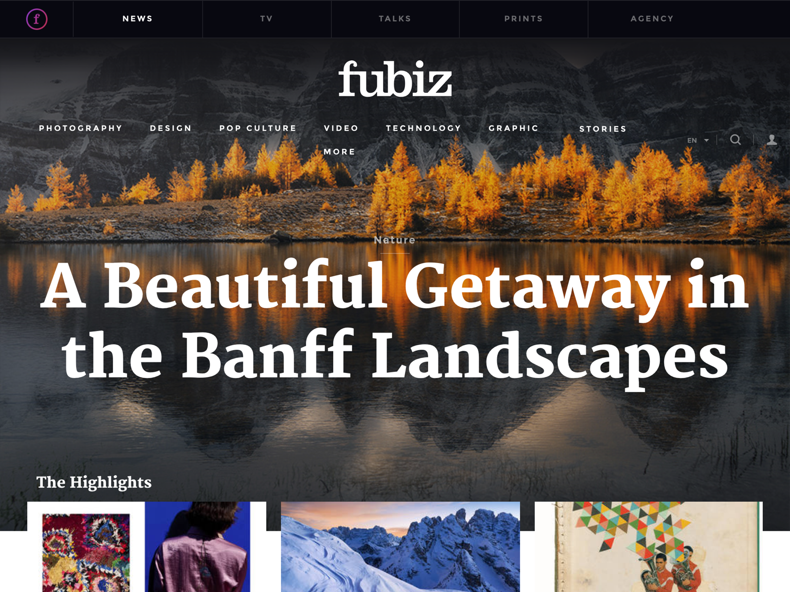
Fubiz
Strenghts
1. Eye-catching highlights section
2. User-friendly navigation
3. Interesting content
Weaknesses
1. Spacing problems
2. Broken links / sections
-
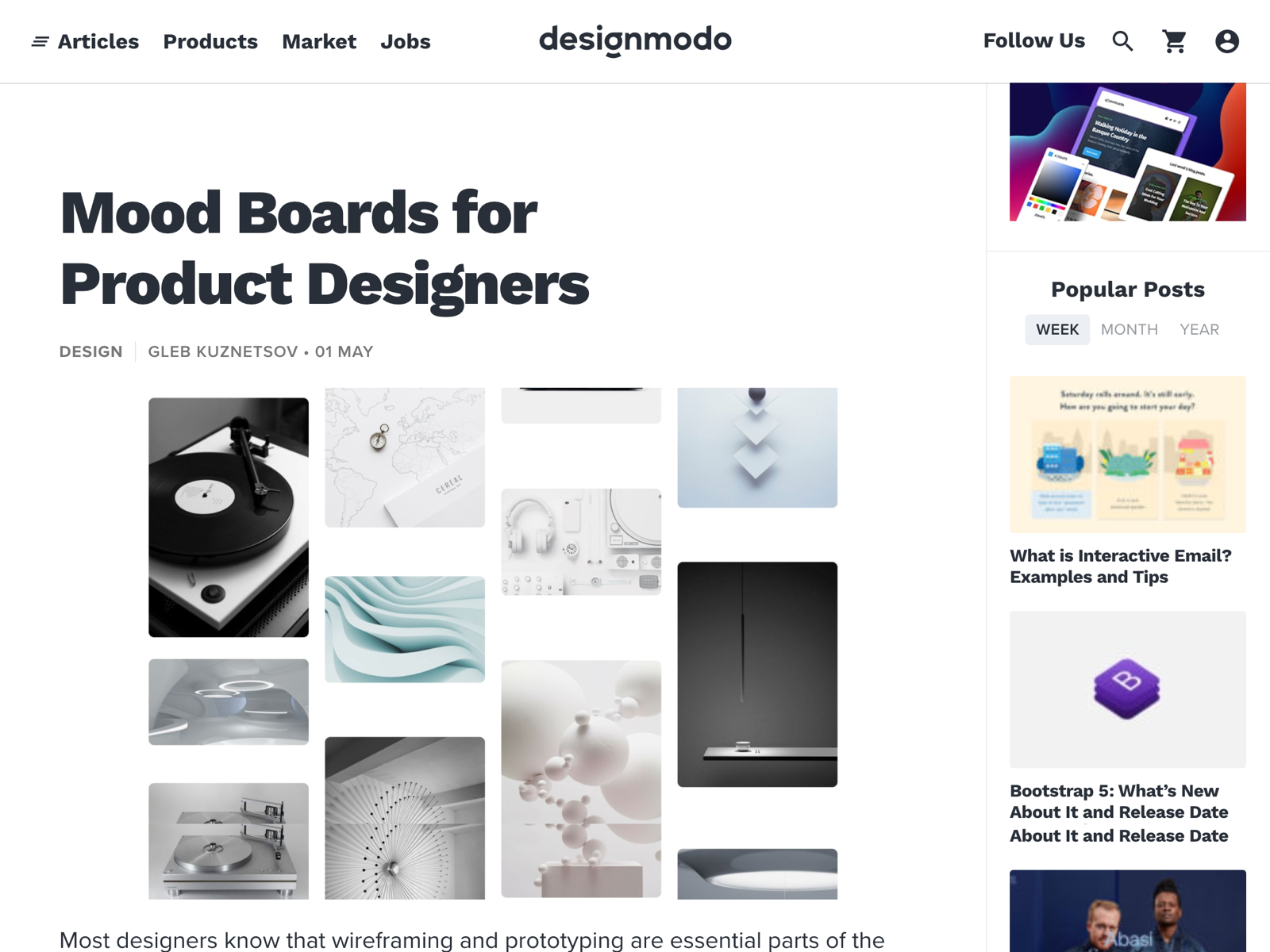
Designmodo
Strengths
1. Consistency
2. Clear descriptions
3. Easy navigation
Weaknesses
1. Image quality
2. Lack of content
-
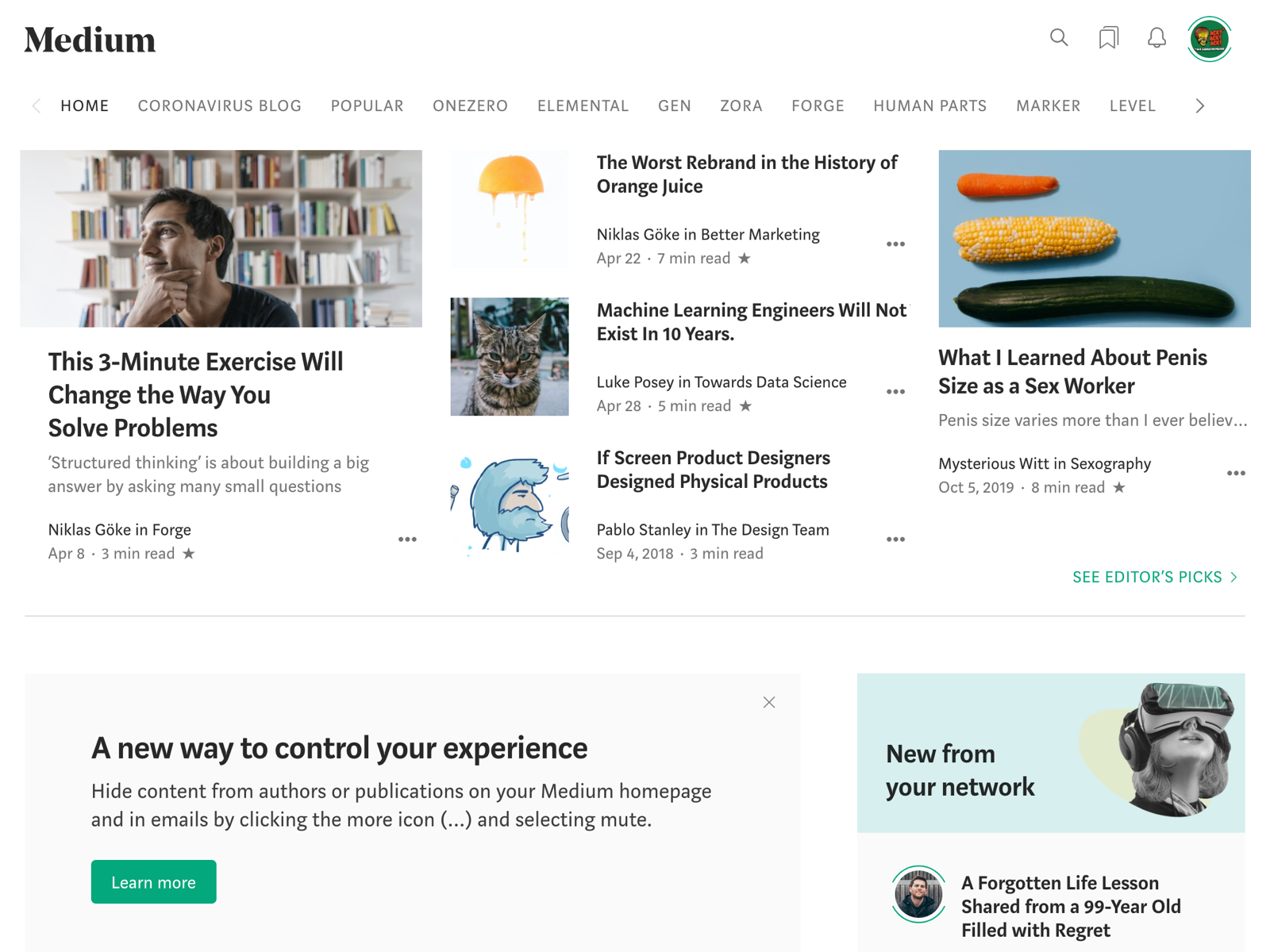
Medium
Strengths
1. A lot of users
2. High-Quality Content
3. Intuitive Navigation
Weaknesses
1. Difficult search function
2. Busy article page

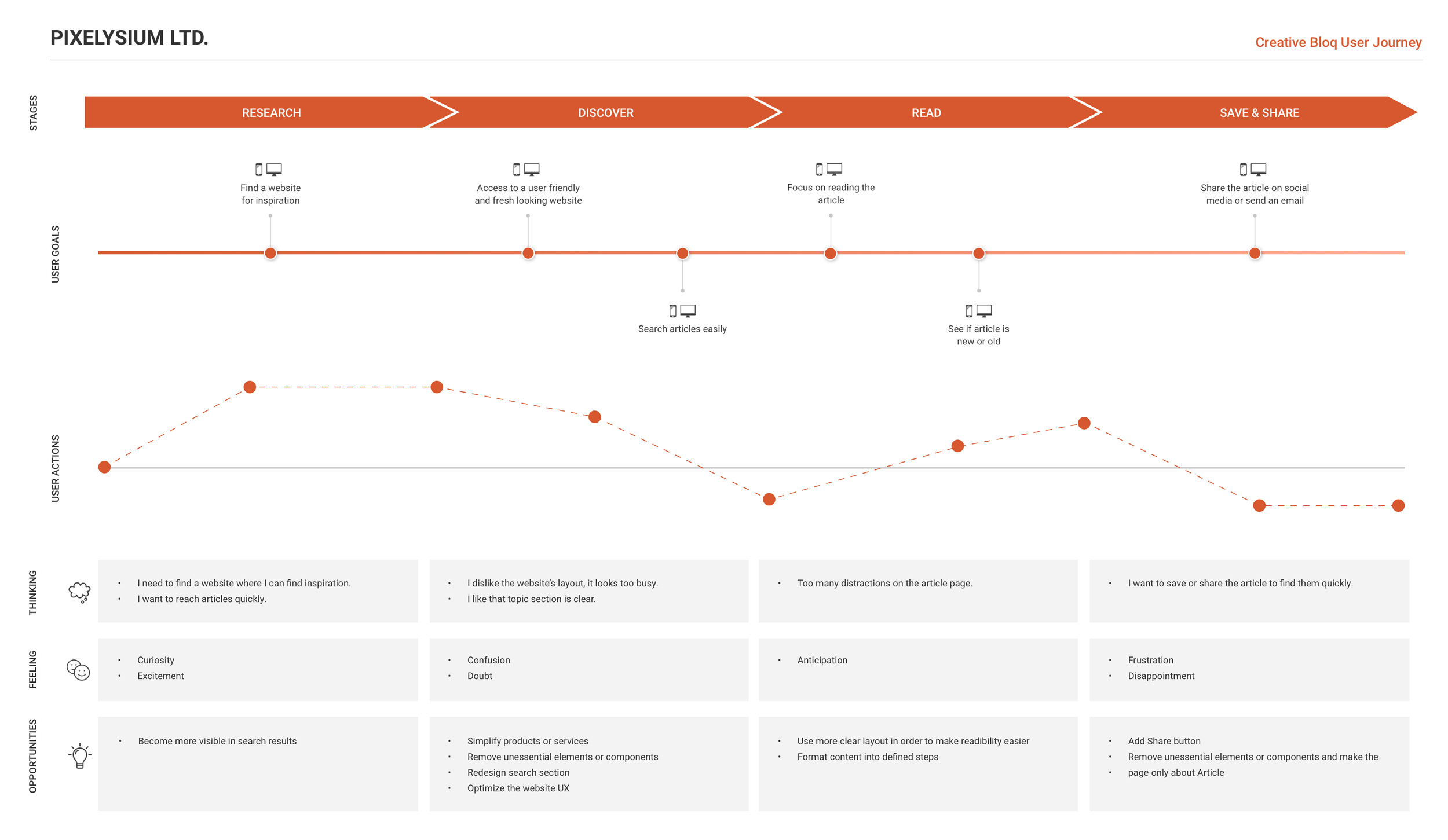
User Journey
Our first goal is to understand our user's problems and create a website with a fresh layout and better navigation to improve the overall user journey. That is why we created a sample user journey to emphasize the key pain points.
User Interview
We have selected people as the users, who work in a creative industry such as developers, designers, illustrators in order to understand key pain points and their challenges while reading an online article. We used the interview method as it gives more insights into what users think about a site, an application, a product, or a process.
l. Before the interview day, we explained the reason for the interview and how the data from it will be used.
2. During interviews, we had a video or phone call.
3. First, we started to ask some basic questions to make potential users comfortable, then we started asking questions based on our research goals.
4. After taking notes and making a list of key pain points, all data were combined and saved for analysis.
Key quotes directly from interviewees:
"I think all the articles are very informative but the user interface looks too busy"
"I don't think I'll use Creative Bloq to read articles as it looks very confusing"
"I like the way how they separated the JOBS section but to me, the second menu below looks unnecessary"
2. Design
I started design process with sketching so I can start to understand how all the data and information I’ve collected may come together.
Sketches
I have always been a pen & paper person so I started sketching low-fi screens that help me to explore my ideas because sketching helps discover potential issues and solutions early, before starting the design.
Wireframe
Wireframing is an important communication tool in any web or app project. It gives the client, designer, and developer an opportunity to walk through the structure of the website without getting sidetracked by design elements such as colours, images, icons, etc. Once I had a visual direction of the layout, I started to add more details and precisions to the sketches by turning them into high-fidelity wireframes.
UI Design & Prototype
The main benefit of prototyping is that it results in a faster and more effective design cycle. Because prototypes allow companies to test their design in the “real world” environment, it is easier to identify potential problems and prevent costly mistakes down the road. Designers can pivot more quickly and interact with the design to troubleshoot and improve any problem areas.
UI Design
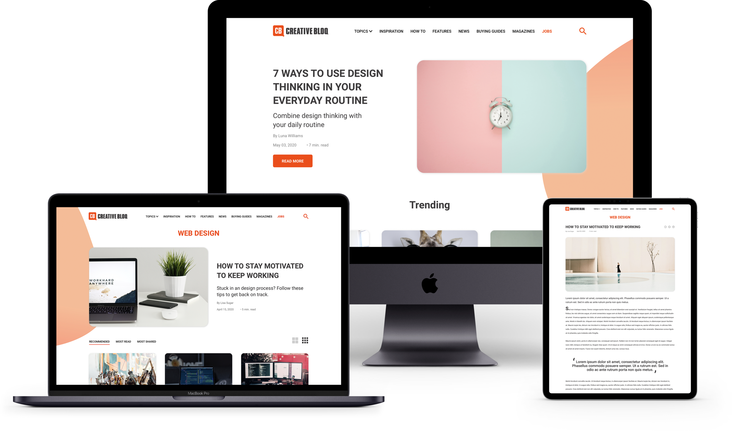
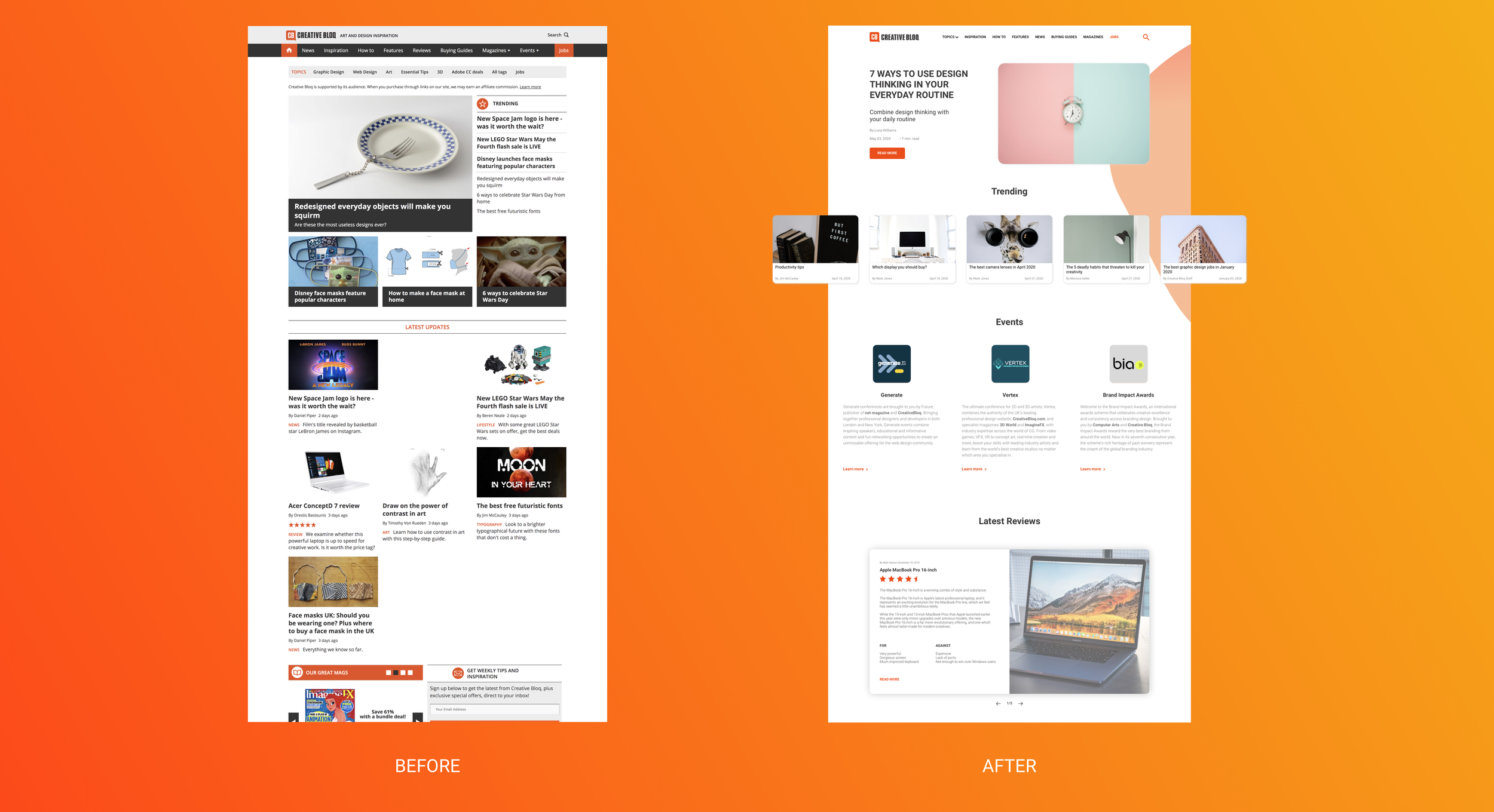
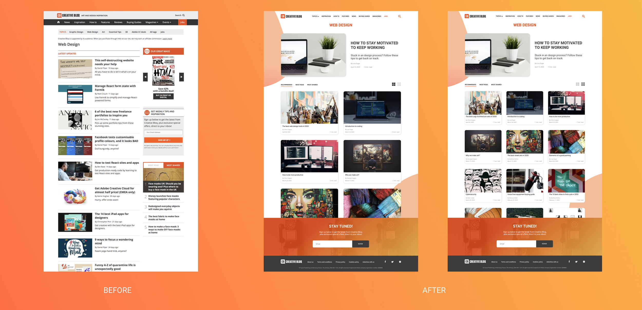
Overall, we've made many changes to the current homepage. The page layout has been completely redesigned, trying to rearrange the hierarchy between elements, components, items, and grouping items and pages.
HOME PAGE
Navigation - We have designed a new navigational tool that brings all similar or related items together so the user will have quicker access to a clearer menu. Furthermore, we also introduced some redesigned sections such as "Trending", "Events" and "Magazines".
TOPICS
Grids - We've designed two different grid layouts to allow users to see as many articles as they want because some users prefer large cards to see fewer cards on the screen while some prefer small ones.
Tabs - Moreover, we've designed a new Tabs section where users can find "Recommended", "Most Read" and "Most Shared" articles that are related to the topic they exist.
ARTICLE PAGE
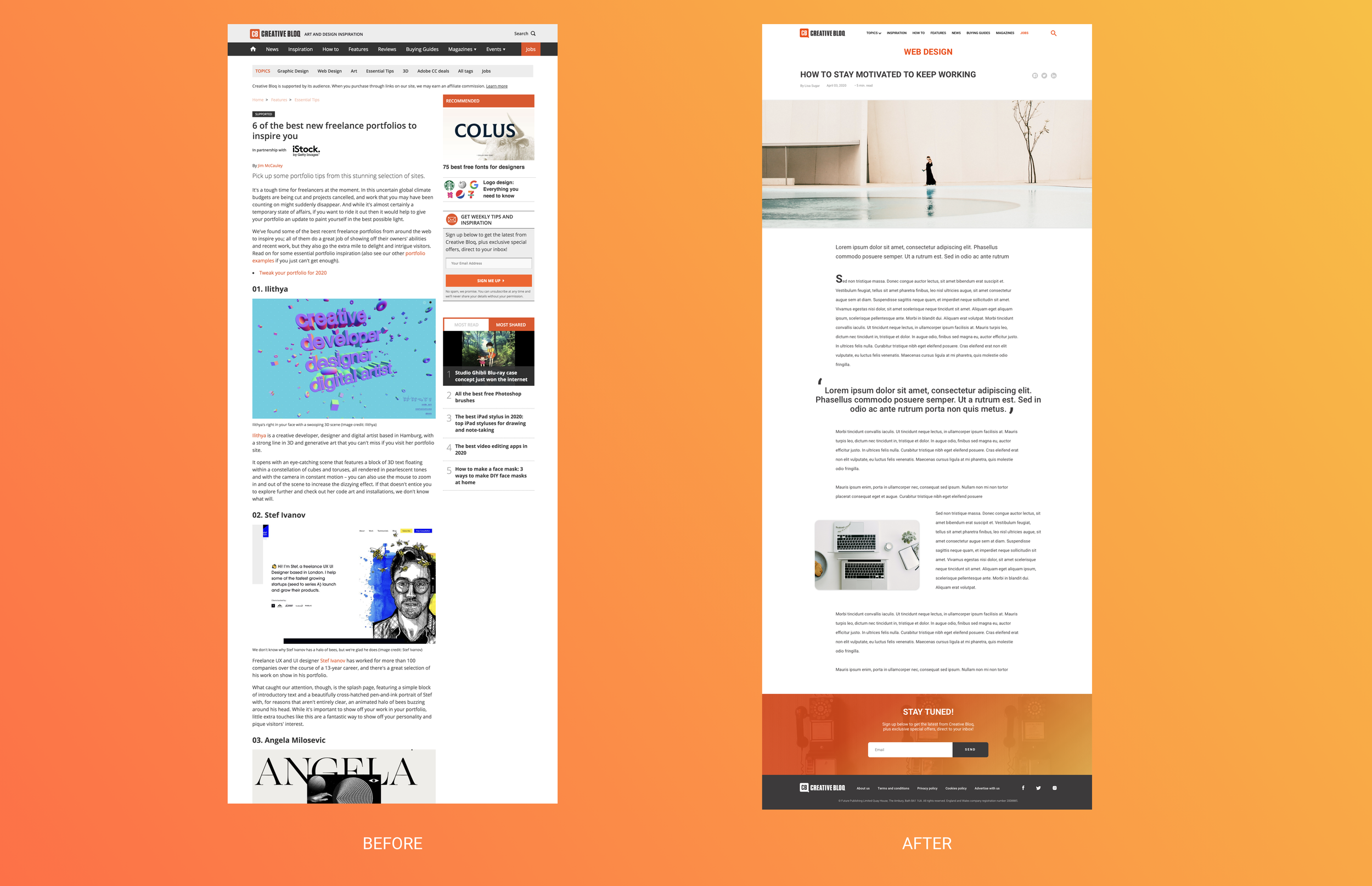
Layout - We've changed the layout completely to bring a fresh and clean-looking page. We've removed irrelevant items and made the page only about the article.
Social Media - Nowadays, most users are involved with social media more than ever. That is why, we've introduced a new feature, "Socials" to allow users to share articles with using Facebook, Twitter, and Linked In.
JOBS
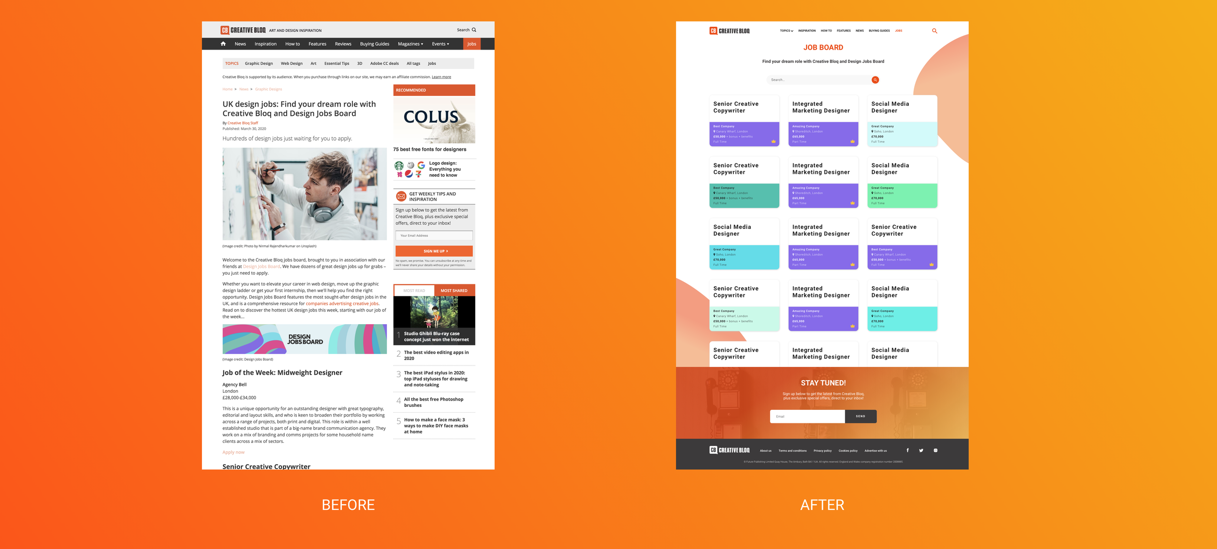
Layout - We've changed the layout completely to make jobs section more clear and effective.
Cards - We've brought job cards to shows all necessary and primary information. By clicking any of those cards, users will be redirected to designjobsboard to apply the selected job.
Final Thoughts
This challenge definitely was an excellent opportunity to think more deeply about article pages and experiment with different decisions. There are still things that can be improved. In case of a real project, this would be a good starting point to design and develop a website to measure the interactions of the users.